


Our brands
For generations, you and your family — including the four-legged members — have loved our brands, products and services. Our Associates are working to ensure that everything you know and love consistently evolves to deliver the best for your family.


Our leaders share their views on tackling today’s challenges
Never has our Purpose been more relevant as it is right now. In today’s fast-moving business, social and environmental landscape, change won’t happen by itself. Our leaders share how we’re navigating with action, today, to create a future we can all be proud of.
Sustainable in a Generation
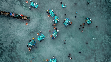
Since we launched the Mars Sustainable in a Generation Plan in 2017, we have made progress to transform how we do business. We’re working to improve the lives of people in communities where we source materials, as well as the lives of our Associates, customers and pets.


Products and services loved by people and pets
Explore more
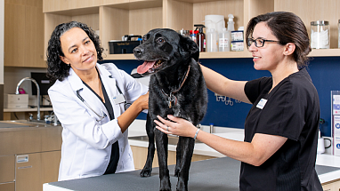
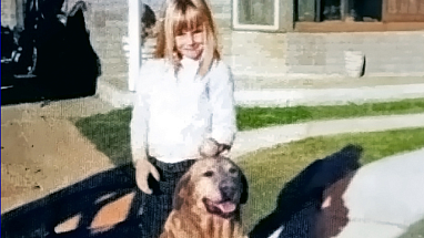
A Better World for Pets™
Our 100,000 Mars Petcare Associates serve the health and nutrition needs of pets in more than 130 countries.


Inspire Moments of Everyday Happiness
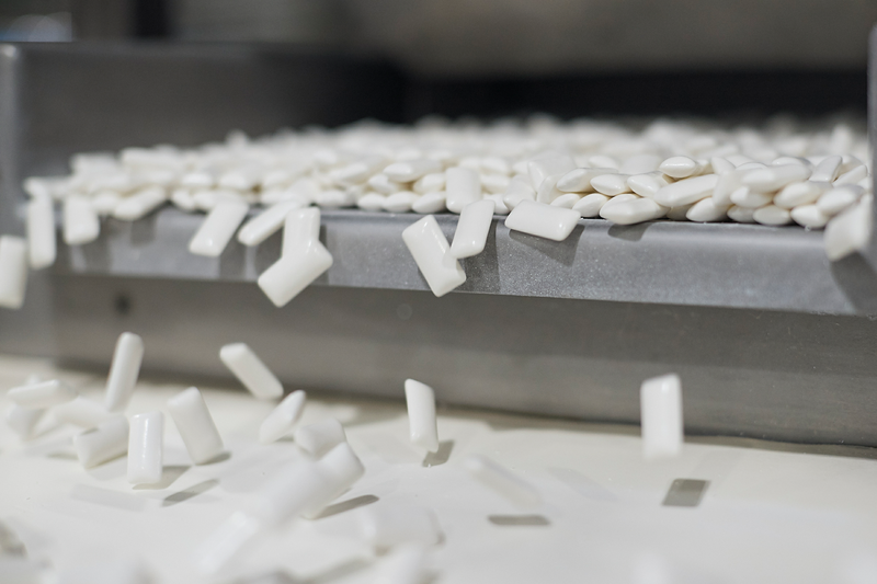
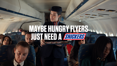
Mars is the world’s leading manufacturer of chocolate, chewing gum, mints and fruity confections. Our Associates work hard to improve the way we source, make and market our products, so consumers can enjoy them even more.

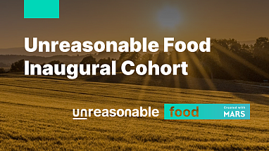
Better food today. A better world tomorrow.
Food isn’t just what we eat. It’s a way for families to bond, laugh, and talk. It’s a way to make a living for farmers. For us, our food business is also a way to contribute to a more positive world.
Today's highlights


Your Tomorrow Starts Today
We have fun. We innovate. We learn. We explore and we work towards making our work a better place today and every day. Want to know more about our work, culture, and people?
